Enhanced image management is one of the best things we see in Drupal 8 and 9. First, the Drupal core adopted the Media package that provides content creators and website admins with handy ways to upload, manage, and reuse images and other multimedia. Next, it got the Responsive Image functionality that makes it easy to load the proper image sizes for all types of user screens.
All this sounds great but it’s even more interesting to see how it works from the inside. Let’s take a little tour of the key principles of work of the Responsive Images and Media in Drupal, as well as review a step-by-step guide on how to set up responsive images in Drupal for media entities.
Introduction to the Drupal Media system
To provide consistency, convenience, and best practices in media management, the Drupal 8/9 core embraced the Media and Media Library modules. They are not enabled by default but are worth enabling on websites regularly using multimedia. Here are the key concepts and components of this module pack.
Drupal Media types and entities
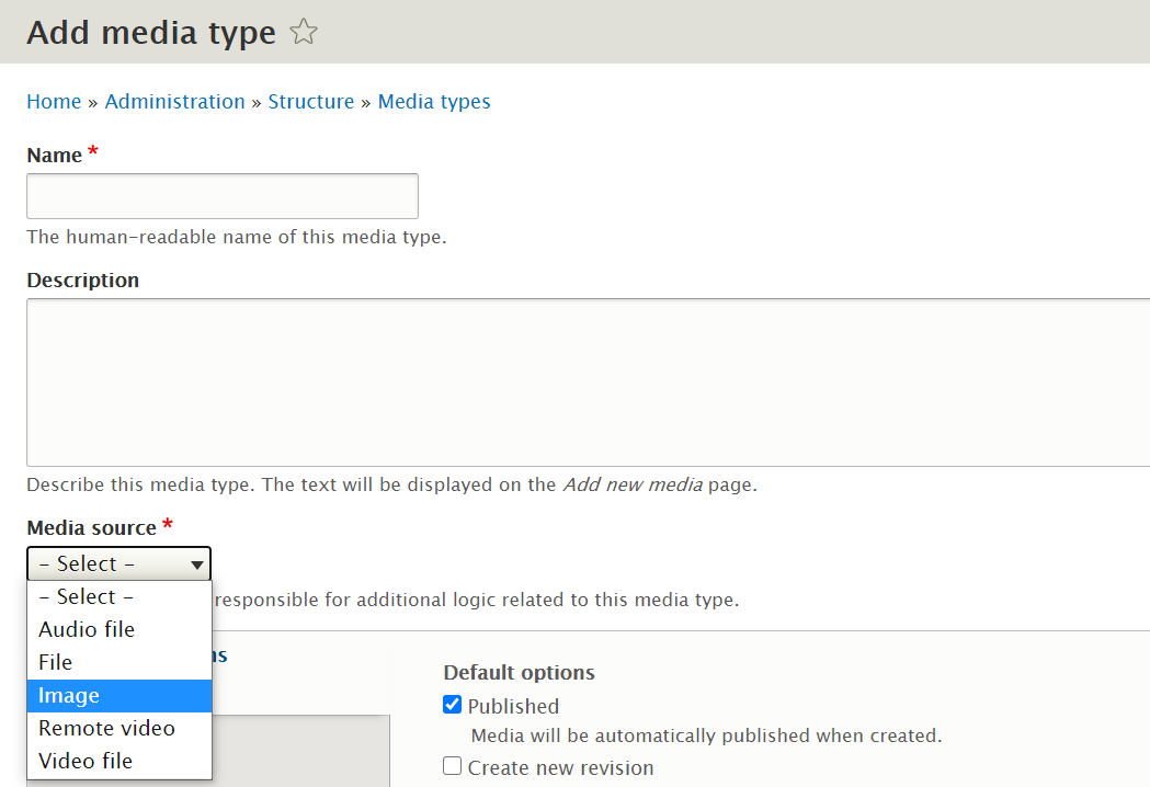
Drupal offers 5 default media types (Audio, Document, Image, Remote video, and Video). This concept is relatively new to Drupal but works in a similar way to content types. Every media entity is an item of a media type just like a content node is an item of a content type.
The key difference between Drupal media types and content types is that content types are actually equal and can be assembled with different fields. Media types are tailored to work with specific resources that add their own logic to them. Drupal also has the Source Plugin that is responsible for every media type being associated with a specific media source. This works for both the default and custom types — whenever you want to create your own media type, the first thing to do is to select the source for it.
Drupal Media field
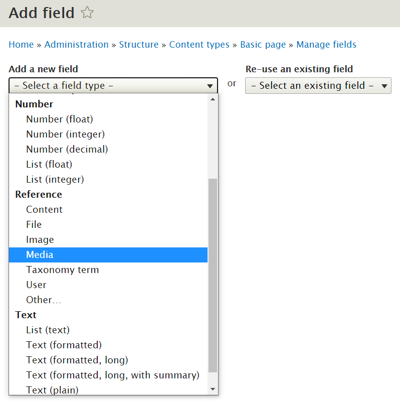
For rich content creation, you can build media into content types on the structural level using the Media field. This is an entity reference type field. With this field set up, editors will see it on the content creation page and will be able to add images, videos, etc. You can configure the field to be of a specific media type or select all types and make it multi-purpose, as well as specify the allowed number of values.
Drupal Media Library
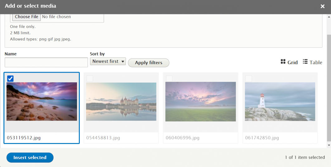
One of the most editor-friendly creations in Drupal 8/9 is the Media Library where you can upload, save, manage, and reuse your multimedia asset. Just a few clicks are needed to add them from the Library to a content node via the Media field or directly to WYSIWYG as an inline element. As of Drupal 8.8, the special Library button is available for the WYSIWYG toolbar providing even better editorial experiences.
A glimpse at Responsive Images in Drupal
Now that we know the basics of Media in Drupal, the next question is how to make all those beautiful visuals responsive to mobile and other devices. This would provide better user experiences and also significantly improve the rendering speed.
The answer to this are the Responsive Image and the Breakpoint modules in the Drupal 8/9 core, which enable you to attach specific image styles to specific user screens based on breakpoints. For example, a user with a mobile device will see a smaller version of the same scaled and cropped image, a user with a tablet will see a medium version, and so on.
The Responsive Image module provides a special image formatter for this and is also responsible for the mapping of breakpoints to the respective styles. It uses the HTML5 picture tag to provide the output.
Whatever images are uploaded to the website, Drupal automatically takes care of their proper rendering if you have the Responsive Images enabled and configured. Let’s see how to do it.
How to create responsive images for media entities in Drupal
Getting the modules ready
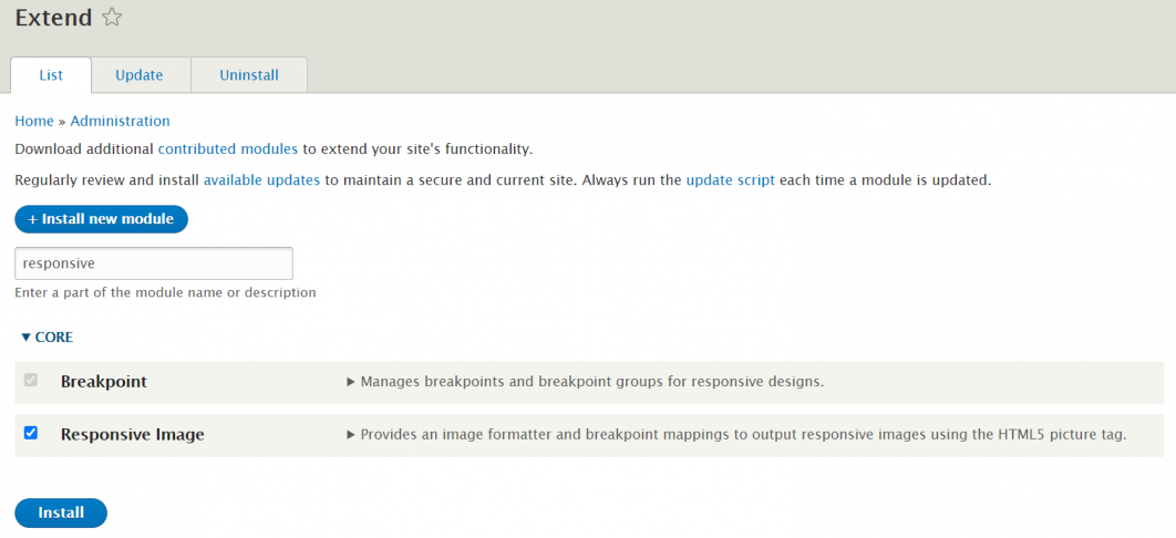
There is nothing extra to install, just go to the Extend tab of your Drupal dashboard and enable the Responsive Image module. The Breakpoint module should be enabled out-of-the-box.
Setting up the breakpoints in the theme
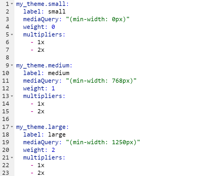
Next, you need to set up the breakpoints, each of which will be associated with a mediaQuery in order to tell Drupal which image style to load for a particular user. For example, starting with the minimum screen width of 1250px, Drupal will load the large image size.
Breakpoints need to be set up in your website’s theme YAML file named something like “themename.breakpoints.yml.” The default themes in Drupal 8 or 9 already have this file with breakpoints set up. If you are using another theme, you may need to create the breakpoints file after finding your theme in the Themes > Custom folder.
The breakpoints.yml file should list the breakpoints from the smallest to the largest mediaQuery. You can add as many breakpoints as you think is best and label them as “small,” “medium,” “large,” etc., by the names of devices (“mobile,” “tablet,” “desktop,” etc.), or in any other way that makes it clear how they vary. The multipliers in the breakpoints are meant to provide better quality for HD and Retina displays. In the end, the file should look something like this:
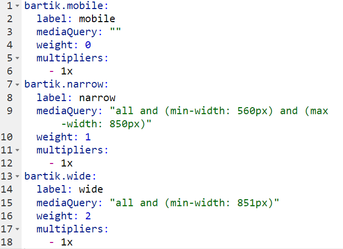
Another example is the Drupal core Bartik theme’s breakpoints file. Its first mediaQuery looks empty but it is equivalent to '(min-width: 0px)':
Creating Drupal image styles
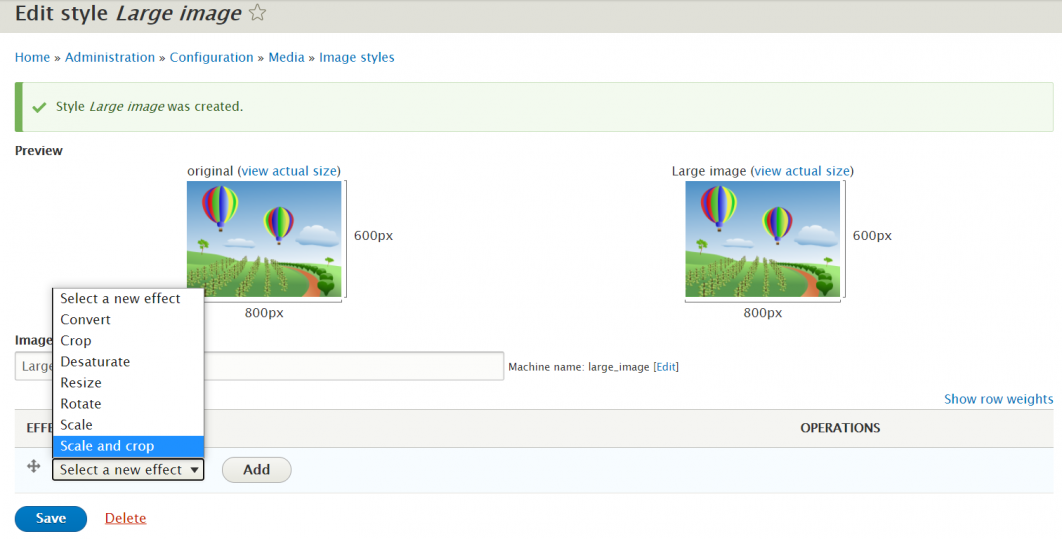
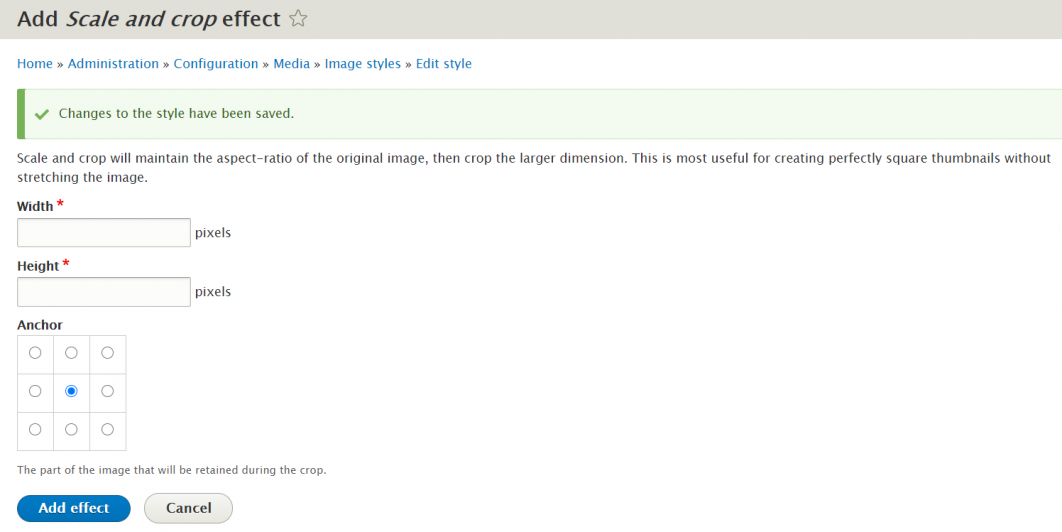
Now it’s time to create the image styles in Drupal, one for every breakpoint. For this task, you will need to return to the Drupal admin dashboard, find the Configuration > Media > Image styles section, and start by clicking “Add image style.” Select a new effect (it’s usually “scale and crop”), click “Add,” and then specify the dimensions for images in each particular breakpoint.
Creating a responsive image style
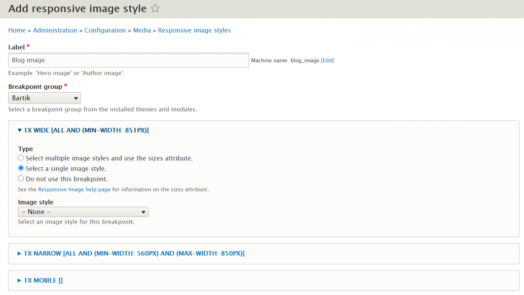
Next, go to Configuration > Media > Responsive Image Styles and click “Add responsive image style.” Give it a name and select the name of your theme from the “Breakpoint group” dropdown.
As soon as you have selected it, you will see your breakpoints displayed, so you will need to attach the respective image style you have created during the previous step to each of them. Expand the breakpoints one by one and set the styles.
The Fallback image style at the bottom of the page will be a one-size-fit-all solution for cases when Drupal will not be sure which size to load.
Adding the responsive image style to media entities
The final step of creating a responsive image style is to add it via the image field to the content type or media type that will be using it. In this case, we want to add it to Image.
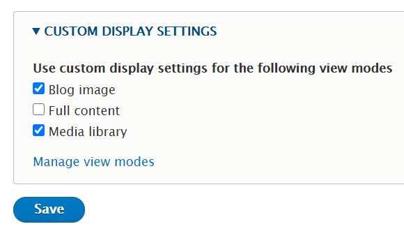
However, there is one more step needed before that — creating and enabling a new view mode for Image. In Structure > Display Modes > View Modes, click “Add new view mode” while choosing Media as the view mode’s entity type, and name your new view mode similarly to your responsive image style. Next, go to Structure > Media types > Image > Manage display, click “Custom display settings,” find the newly created view mode, and enable it with a checkmark.
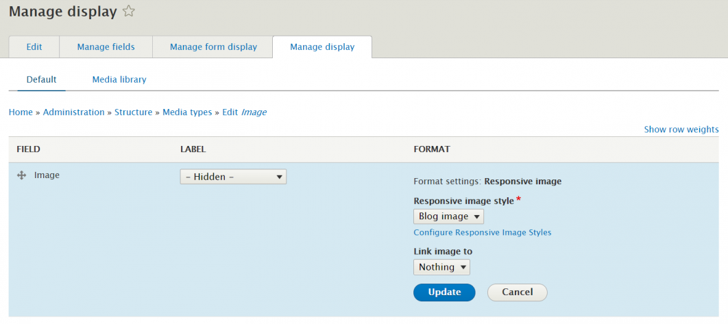
Next, find the image field on the “Manage display” tab. The field label needs to be set to “Hidden,” the field’s format to “Responsive image,” and then the actual responsive image style needs to be selected using the cogwheel.
To sum up
This has been an overview of how Media and Responsive Image Styles work in Drupal. The modern approaches to image management in Drupal have greatly increased the number of happy users, happy editors, and happy developers. If you need help with creating responsive image styles in Drupal or setting up your media configuration in every detail, drop us a line and the Golems team will get you covered!

Comments